Sunday, January 27, 2008

flowers and coffee

This morning, while visiting her family in Encinitas, Katy and I went on a strange dual errand, for a small flower arrangement (portrait session-Katy) and a coffee (internet fuel-me). After an unsuccessful attempt at one-stop-shopping at a nearby grocery store, which had only bad coffee and bad flowers, Katy realized that there was the perfect combination across the street:


Encinitas often feels to me like some sort of alternate suburban utopia, as if it is somehow immune to the blandness and impartiality that I'm used to seeing in the outer reaches. This is a prime example. These local businesses aren't protected by neo-marxist community law, tourist flow, high property prices, or even a walkable neighborhood. The coffee shop is drive-by only (although I walked up to the window, which may have precipitated a free size upgrade). There are plenty of Ralphs, Starbucks, and Targets down the street. And yet the area is almost choked with small businesses and restaurants co-existing peacefully beside their corporate counterparts. Every time we drive down I try to figure out why it works.

It might be as simple as the ocean, a mile away and a constant presence in this linear city. The Pacific is a social aggregator for these towns, providing lots of recreation and chance contact, and keeping house prices elevated (although, at least this far north, not ridiculous). This, combined with the topography and preexisting older neighborhoods, keeps developments, and their constituent lots, small and packed together. Most of the side effects are seen between the 5 freeway and the beach, in a string of cute, well-preserved main streets and boardwalks. But a secondary (and for me, more powerful) benefit is in the thriving tiny businesses in the second floors and back lot pads of strip centers over the hills. There is an addictive combination of jerry-rigged, frugal atmosphere with surprisingly high quality that is endemic in the burrito stands, haircut stores, sewing emporia, and, yes, flower shops you find scattered along this stretch of North County.

So I got my coffee and Katy got her flowers:


And we both went home happy.

Tuesday, January 22, 2008

shaken to sleep

We saw Cloverfield this weekend and I had such a negative reaction to the movie I thought I should share. Like most people in the theater, I left jumpy, disturbed, and vaguely nauseous (someone actually left an acidic gift for everyone in the hallway before the film was over). This was mostly explained away as a consequence of 80 minutes of deep booming noises, shaky camera work, and a few exploding people. Feeling shocked after a movie is not a new experience. What was new was the black mood that set in almost immediately thereafter, which I could not shake for a full day. That, I believe is the consequence of what was missing, not what was actually there.

Cloverfield is a unique film in that it is almost completely absent of exposition, character development, and basic plot. What is left is a bunch of loud noises, grisly visuals, and the slow and steady revelation of what "Cloverfield" looks like, which reaches a somewhat disappointing climax in the final 10 minutes. To me, the lack of any explanation, greater story, or emotional attachment makes this something less than a film. As an experience it lies somewhere between a circus slideshow and being taped into a cardboard box and pushed down a flight of stairs.

Without the context provided by basic story elements, the 80 minutes of loud noises and visual shocks couldn't be processed as anything external to my own experience. So instead of spending my time after the film thinking about it as a piece of dramatic art, I instead just coped with a mild case of post-traumatic stress. Not my idea of a good time.

PS- There is something seriously wrong with our national culture that this movie is PG-13, but if I'd seen a nipple it would have been rated R.

Tuesday, January 15, 2008

GM-C and cityofsound, too

#1: Gordon Matta-Clark at Ubuweb.

#2: Great (and I mean great) city of sound presentation on possible parametric/sustainable futures.

#1: Watch these videos and marvel at how much they look like Snohetta projects.

#2: Shoot in a comment to let Mr. Sound know what the future will really be like (besides shiny and warm).

Thursday, January 10, 2008

Open Letter : Dinos Chapman

The other day I decided to spend my morning drinking half a pot of coffee and letting my eyes vibrate across the 159 fantastic pages of the new Bibliodyssey book. In front of all of the crazy imagery was a foreword by artist Dinos Chapman. The forward was actually declared a 'forewarning' about the internet in general, which Chapman describes as a "treacherous minefield to be trodden with trepidation if it is to be used for anything other than a purient delve into the seamier side of human frailty." Mr. Chapman's was certainly being deliberately crass and provocative, but I feel the need to comment on it anyway (there's a wonderful symmetry in giving sober reflection on the internet to a crass and provocative printed page, for one.)

The essay seems intent on disproving what the book itself seems to suggest, that the internet contains unearthed hidden treasures and knowledge free and waiting for discovery. Chapman writes that digital life has "been dragged down to its lowest common denominator, a labour-saving device of the most crass order: a less than useless tool for ordering cold inedible pizza from around the corner, a plain cover wrapper for pornography, the discrete purchase of Viagra, the sending of virtual birthday cards..." To me, the entire two pages seems more like a personal expose or confessional than a true piece of analysis, a man attempting to hijack this deeply considered and well curated book with a strange kind of literary exhibitionism. The foreword to this book could have taken any number of tacks-- the issues with digital archiving, copyright and originality, visual culture, a nice short story-- instead all I got was a person I care little about telling me that he spends a lot of time at rotten.com, and lecturing me about how by spending time on my computer every morning I am a lonely, distracted hermit in search of ever more esoteric forms of titillation. Thanks, Chap.

What is the best future scenario for this kind of outlook? A return to salon culture? Post-apocalyptic hunting and gathering? One of the more obnoxious things about the foreword is that it tries to cast in internet as both banal marginalia and all-encompassing dystopia. In other words, a shrill prophesy of the inevitable decline of (post)modern culture.

Please, Mr. Chapman. The kids are alright.

Tuesday, January 08, 2008

obsolete but still funny

Now that Hilary's had her day maybe it's time to look back, back to five days ago when everyone was surprised. The Huckaboom and the Obamawagon is a hi-styrical romp by Kevin Gilfoile and John Warner in the Morning News (maybe the most attractive internet news source available). These letters back and forth are sprinkled with nuggets of joy such as "Fred Thompson is running for president with the enthusiasm of a nine-year-old shopping for Sunday pants," and "The Giuliani campaign is the result of the same delusional miscalculation that’s causing Amy Fisher to market a sex tape. Amy Fisher isn’t famous for being sexy. She’s famous for being a bad shot."

But my favorite bit is at the end, when Kevin dissects a latent national (or maybe just personal) desire to pick one's president by "identifying the person I want representing this country to the world." For me, I didn't realize this desire until I had eight years of bumbling speechies coupled with headstrong assholeocity. So, unfortunately, right now what drives me most election-wise is the prospect of being envied by Europeans, and maybe some Russians. Or, if that's unattainable, only being embarrassed for my nation once a month, tops.

Sunday, January 06, 2008

no-fi

Ok, I promise I have a post of real substance coming down the pipe, but as it is I'm tired and the bed is warm, so what you get is this:

Maybe it's just nascent music snobbery, but Rolling Stone is the last place I expected to find a comprehensive, well explained primer to the problems plaguing contemporary pop music production. It's called "The Death of High Fidelity" and it explains in exacting detail why your new music is so much less exciting than the old (sorry, blanket statement, I know). The quick answer: digital compression is the devil incarnate. Somewhere around 10 years ago they found a way to completely eliminate dynamic variation, creating a literal "wall of sound" that catches attention immediately but can't sustain it. Add in a host of local compression devices in everything from itunes to your car stereo and you get some serious one-dimensional shit. And that's all before you even get to the generally low quality of most downloaded MP3s. It's pretty ironic that while the fidelity of the average home stereo system is rising (excepting those shitty ipod earbuds), recording quality is tanking like there's no tomorrow.

My favorite moment in the article are these captioned waveforms:


Nirvana
"Smells Like Teen Spirit"


Arctic Monkeys
"I Bet You Look Good on the Dancefloor"


Good job, Rolling Stone. Let's get some space in those there songs.


***Addendum: looking around I found via me-fi another great article with a more in-depth history. Also, this YouTube video.

Friday, January 04, 2008

merry xmas from the marshall islands

I was reading PK's fantastic new post at Bibliodyssey this morning and caught a reference to atomic blast Christmas cards existing somewhere in the Scripps Oceanic Research Digital Archives. A quick search and here it is:


Makes me wish I knew more physicists come holiday time.

Friday, December 28, 2007

Back (barely)

Okay, so holidays are over and it's back to irregular blog posting. Well, maybe a few after this weekend. I promise.

Until then: check out totally awesome Hugh Ferriss renderings at this museum and on this flickr set. This stuff vascillates between space-age modernism, neogothic mountains, American Futurism, and just generally kick-ass stuff with a paper and pencil. Honestly, this is the basis of the middle fifty years of architecture in the last century, not efficiency, not theory, not some hidden socialist agenda. At least not in this country; here, the acceptance of bombastic high modernism was more about the Jetsons, popular mechanics, and the mind-blowing rendering skills of guys like this.

I really don't think that much has changed.

Saturday, December 15, 2007

kindling for the fire

Maybe starting off with a terrible pun was a bad idea.

OK, I'm going to make a stand here. I'm going to risk apostasy and say it: I kind of want a Kindle.

The online jeering at Mr. K has become somewhat silly. I have never seen so many reviews of a physical object (especially a piece of personal electronics) that were done without even touching or using the object. The internet is being used as a ten-foot pole, people are just poking at it and then wringing their hands, saying "it looks like an obese albino blackberry!

Even from a purely compositional standpoint I'm not that offended. Since when is random asymmetrical chamfering a terrible design concept? And don't tell me it's about the interface. You have to touch it first if you're going to talk about that. In fact, the public reaction is far from terrible. The first run has sold out. Nerds like it. Old people like it. And these people actually have one. They're not shrieking "see! see!" when Philippe Starck says something critical, jumping on an anti-hype bandwagon that is becoming increasingly divorced from reality.

Actually, the Blackberry is a great example. This is a device whose original looked like a half-chewed version of its namesake, had the color choices of a facial bruise, and had buttons so small you had to carry an infant around with you as an operator. And the last time I checked, these little monsters weren't going away.

This isn't to say that I think that this device is anything fantastic. One typface? No USB port? Unholy DRM? And yes, I'd much rather this thing had been designed by Dieter Rams. But it's not. And I'm still curious, because this thing is responding, if not perfectly, to a deep-seated desire for an as-yet unaddressed solution. So get off your iPhone high horse and touch the damn thing before condemning it.

Thursday, December 06, 2007

Sim Kong

I spent about a half hour today being mesmerized by the sterile isonometric beauty of the Edushi Hong Kong site. Whoever made this map has gone full-circle, reimagining a city - in great detail - in Sim City vocabulary. Parking lots? Check. Construction sites? Check. Monstrous housing blocks? Double-check. They even have little trucks with shipping containers next to the docks. Check it out:


I am having some trouble figuring out exactly whom would find this mapping system useful (although I am tempted to tile together screenshots and wallpaper my room with them.) Perhaps it was made by an evil superbeing bent on dominating Hong Kong and slowly guiding the city growth and policy, as in some sick, humongous game. Followed by, of course, destroying it with giant monsters.

Sunday, December 02, 2007

radical cartography

I was drawn into the radical cartography website through the following image in ffffound:


I'm a sucker for scale comparisons. Poking around, I found a lot of other wonderful map-mashups:


Including this awesome series called "The Errant Isle Of Manhattan" in which the aforementioned island goes on a sightseeing tour (inspired by Rem's epilogue in Delirious NY, natch):


I'd like to see this continued. Maybe New York should go on a European Tour? Visit the Dead Sea? Or maybe enact an epic naval battle against Key West and the Fleet of Venice? Or float North, eventually embedding itself within the seasonal ice in the North Sea, only being freed after decades of global warming?

Kind of reminds me of this Lie-Ins and Tigers drawing:

Tuesday, November 27, 2007

Bloch redux


(all images courtesy of my lovely wife)

While in KC over Thanksgiving I got a chance to revisit the Bloch building at the Nelson-Atkins fine art museum, this time at night and filled with art. That same night they were hosting a scupture park tour, which is the source of the little bags lighting our way.


The bags highlight something that I hadn't noticed before-- the total absence of streetlighting around the building. The diffuse (but bright) glow that the building itself emits is more than enough to see your way around, and has a wonderful effect upon the contained spaces of the sculpture park-- it becomes a series of comfortable and familiar outdoor rooms instead of threatening surplus space.


The entire effect of the museum, in fact, is very unimposing. One can (and I did) walk up the grass right to the channel glass, and rap your knuckles or slap your palm across the giant lantern. Kids were rolling down hills next to softly lit Moore bronzes. And then there's the fact that admission is free and one can enter the museum at any exterior door, promoting a kind of indoor-outdoor meandering that seems totally foreign to any previous museum experience. Rounding this all out is the fact that, despite the expected occasional slipshod detail or muffed corner, all of the points of human contact in this building-- the handrails, the doors, the floors and paving-- has been deeply considered and is a delight to regard and to touch.


I can't express how ecstatic I am that my hometown made the choice to build this building. This is easily the one of the most boundary-pushing new art museums I've seen, and it does it without grandiose scale, formal histrionics or an exceptional collection. This is, despite all appearences, not a magazine or coffee table museum. It is first and foremost a community asset.

Sunday, November 18, 2007

I'll take mine in "churlish," please

Katy recently heard another photographer cite a web-business adage that I'd never heard before. Apparently, ugly websites sell more. This is not all websites, mind you, but rather websites attempting to aggressively sell something. This photographer had switched print sales sites from one with an elegant interface to one that was markedly uglier, and he saw an immediate uptick in sales. There seem to be a lot of theories about this-- ugly websites are inherently simpler, ugly websites seem more trustworthy, ugly websites usually sell cheaper goods, etc. I have another theory to posit-- that these sites are more approachable, and because they're so bare bones, you feel like you're getting a great deal even if you aren't.

This is the same idea behind bargain retail-- yes, there is usually less overhead in bargain stores, but don't you think that DSW or Filene's Basement makes enough money to, say, put in partitions? Or maybe use lighting that's not ripped directly out of a high school gym? These spaces are not entirely about saving money. They're about creating the atmosphere of savings, replicating as exactly as possible the feeling of a swap meet or flea market, pulling pages out of a book that goes as far back as the Agora.

What is the equivalent domestic atmosphere? Is there some sort of stage set you can produce that will make you seem instantly trustworty? Wise? Fearsome? If so, I'm sure you can buy it at Pottery Barn. It seems like our national industry has become the perfection of atmospherics, or "lifestyles," if you prefer the vernacular. It's not too different from the future Neal Stephenson posits where the only three things the USA is still #1 in are movies, code, and pizza delivery. Not that I'm going to start wailing for a return to honesty and simplicity. But I'd much rather have things reach out and smack you every once in a while, instead of sitting in the corner and glaring. I prefer my design to be active rather than passive. This is not an aesthetic judgement, nor a social one. Maybe just more products that answer the what, how, and why rather than the where, who, and when.

Wednesday, November 14, 2007

back!

So we have returned from our 2-week Normandy/Paris/NYC sojourn (with a brief stop in Cleveland to eat bad airport food). My first post is about the new public bike system we got to see in action in Paris.

They're calling it Velib', a bad french mashup pun, kind of like calling it "bikereedom." Or maybe "cycliberty" In true public transportation style, the logo is hideous:


... and the bikes themselves not too stunning either:


The bikes are, in my opinion, both ugly and slow, but this is probably a plus, as it keeps them from being stolen, and as nobody in Paris wears a helmet, a low maximum speed is pretty necessary. And they work! Each bike has an integral stand, lock, light, and basket. To check one out, you must either have a year Metro pass, or get a special card from the transportation service. Either option requires both a bank account and a physical address in Paris, which makes it difficult for anyone but commuters to get a hold of one. This is irritating if you're a tourist, but with the popularity of these things it's a necessary evil. You get your first half hour for free, with incremental charges afterwards (ramping up such that you probably wouldn't want to have one for longer than an hour and a half). You can return the bike to any stand in the city, which are easily found due to an entirely new street sign system that points the way to the nearest one. The Paris bike lane system has also been massively upgraded and expanded, many of the lanes dedicated with their own curbs.

Did I mention that these things are popular? I would estimate that more than half of the bikes I saw in Paris (and there are many) were Velib bikes. I never saw one visibly broken, never saw one being obviously misused, and 99% of the time there was at least one available bike and one available extra parking spot. While a longer term is certainly needed to give a final verdict on the success of this system, it seems to be working fantastically right now. It's making the Metro less crowded, while adding visual interest to the city and reducing carbon emissions (maybe). Oh, and bikes cannot strike. Why don't these exist anywhere else?

Friday, October 26, 2007

from one dead space to another

I haven't really posted in the last few weeks thanks to an incredible busy weeklong stretch of work to prepare for.... more online absence! Katy and I are taking off two weeks to visit Normandy, Paris, and New York. I'm sure there will be thousands of pictures to follow in mid-November. But for now, all you get is quick ruminations on the lovely wildfires we've had here in Southern California.

1: It has only recently become clear to me that weather conditions exist that can spontaneously start and sustain immense fires. The wind and fire are not independent of one another; this is literally fire weather. If you have 70mph winds, 3% relative humidity and a dew point of negative 25 degrees, it's fire weather. Fire weather starts, without fail, every week before Halloween. It's a season, not a disaster.

2: It is facile to compare natural disasters. Much has been made of the national response to the San Diego wildfires vs. Katrina. Leaving aside the obvious differences in income demographics, car ownership and urban structure, a fire is not a flood. Fires destroy series of homes, at random, along specific routes. If you get caught in a house, you die, but you usually have a day's warning. Floods destroy every house for blocks, can have only a few hours warning, and can be survivable if caught. The only thing these incidents have in common is that FEMA is involved.

3: To continue in the spirit of #1, fires make me even more aware that Southern California has an intricate overlaid geography of wind patterns. Smog and the marine layer are one thing, but you don't know that Long Beach gets blanketed in dense smoke and ash from any fire within a 60 mile radius until it happens. A lot of where you live here is in the air above you-- on any random summer day it's 100 degrees with blue skies in one place, with 75 and cloudy 10 miles away. This is a product not only of the mountains, which channel every tiny breeze, but the fact that SoCal is bracketed by ocean on one side, desert on the other. It's like a giant game of wind pachinko, or some kind of Bernoulli Test Landscape. Oh, and there are lots of jets here. Screw Wyoming. Big Sky Country is in LA.

Wednesday, October 17, 2007

strangemaps explosion


There has been a flurry of activity on the strangemaps blog recently which is worth checking out, particularly the Japanese USA Board Game Map and the Map of the Apocalypse, as well as plenty of geocultuhistorical goodness. Go to!

Sunday, October 14, 2007

architectural API

I found this blog entry a few days ago buried in the city of sound del.icio.us links. It's a well-written rumination from a "random" GSD student suggesting that architecture might learn from the rapid development of web programming, which is summarized as
"1. rough html -> 2. static sites by designers -> 3. flash and information architecture (parallel streams) approaches -> 4. template driven design hooked to massive databases (even for personal sites)/web 2.0 cross-site interactivity.
I see architecture at being at best in stage 3 (if not in stage 2) of this. If we can precipitate a stage 4, then I think things will be interesting."

It then goes on to try to define exactly what the analog of web 2.0 would be for architecture. What comes out is interesting if a bit hazy-- something like shelter+decoration+organization+processing. In my mind the answer is something a bit more literal-- if we had an accepted standard for BIM files, and a national code system that superceded most state and local building codes (especially MEP), then we might have something close to a plug-and play, open-source standard for building components. Large producers of things like window walls, prefabricated structural frames, PEX radiant heating and greywater systems could then provide libraries of digital components you can plug into your design and mash up with custom work of your very own. No checking to see if it'll work with the local inspector. No making sure that the j-box is in the right place. And no calling to get the cost and lead time- this is built into the component in the first place for parametric tastiness. If architecture is going to be anything like flikr or google maps, this is the way it's gotta be.

Wednesday, October 10, 2007

believers

Sellaband deserves some recognition as a fully realized, working example of an alternative social framework, that produces works of art, made only possible by the internet. It is a self-catalyzing popular music production device that, from the looks of it, might become so popular in the near future as to become some sort of A&R pyramid scheme.

Here's how it works: you convince people (somewhat ominously referred to as "believers" to donate $10 towards your band. Current believers help to convince more people until you have reached a final count of 5,000. This collected $50,000 is then used to hire a professional studio, producer, and sound engineer to make a record, copies of which are then distributed to each believer. These people have a license to sell off their extra records (of which they get an unspecified amount). The recording is also available online, for free. If downloaded, the band gets a cut of the ad revenue that Sellaband generates, and so do the believers. In other words, if you donate money to help get the band recorded, you now own stock in the record, stock that pays dividends based upon its popularity, and the popularity of Sellaband as a whole. This is a record label with the business model of Amway, which is brilliant-- the entire music industry (and that of any popular art) has always been based mostly on hype, and bands have often used their most devoted fans as free PR and advertising. But now the process is self catalyzing, which makes it far more powerful than anything Radiohead may be planning in the near future. It's also thrilling that it appears to be happening on such a global scale-- only a fraction of the listed bands are from the US or UK, making it seem that artists from other locales are using this as an opportunity to get the word out.

I do have some issues with this model for music production and promotion. For one, while it's probably better than basing a label's contracts on market research and the safest possible option, popular opinion alone won't often stretch boundaries or support the fringe acts that keep art from getting stale. And as such, unless a more consciously esoteric form of Sellaband shows up, small labels and self-releases will still be very important. I'm also not sure what exactly would happen to this model should it reach a certain size-- it's great when a band gets a contract every few weeks, but what if there's a new group to promote every day? Or ten a day? And finally, part of me is worried that profit is now creeping into the last bastion of the experience of popular music-- supporting and promoting your favorite bands. If everyone is now in A&R, is anyone really listening to music just to listen?

Saturday, October 06, 2007

three photography links

Polar Inertia, a somewhat addictive photo catalog/journalism site about (mostly) the American West and Pacific Rim.

Seam Carving
, soon to appear on a website near you (and probably a tool in Photoshop CS4). Free tool to play with here.

PhotoSynth and Seadragon
, two spectacular technologies that Microsoft has locked in a vault (video is a 6-month-old TED presentation, but it's new to me so I'm passing it on).

Tuesday, October 02, 2007

apologia + largest. camera. ever.

Well, it looks like my quarterly spurt of activity has ended at last, given that I am now going weeks at a time without a decent post. I'm going to respond by capitulating to my slothfulness; I am holding myself to one good and one lame post a week now. To begin:

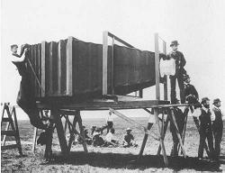
Katy has been listening to a fantastic multimedia photo-history podcast from an uncommonly devoted community college professor. One of the last mentioned what was and probably will remain the largest conventional negative camera ever made, used by George Lawrence to make a 4 1/2 x 8 foot glass plate negative of a locomotive for the upcoming Paris Exposition (Lawrence is most famous for using kites to lift cameras to 2000 feet for arial panoramas, such as those of San Francisco immediately following the Great Fire). Here it is in all of its 1400 lb glory, with about half of the team necessary to operate the beast:


and


Further research
revealed the existence of the Moby C at 2nd and Bleeker in NYC, the largest polaroid camera in existence, capable of 40" by 106" prints. It was originally used to make life-size reproductions of paintings, but the scale is also, incidentally, ideal for life-size polaroids of humans as well. There is something about capturing 1:1 images that makes photographs break the bond of representation and recapture some of Walter Benjamin's destroyed "aura". It turns the camera into some kind of frozen mirror, a human-capturing device.

But no discussion of gargantuan cameras would be complete without a mention of the (very recent) Legacy Photo Project, which captured a 25' x 100' cloth negative using an abandoned aircraft hangar as a gigantic camera obscura:


So here you have it, the world's first Borges Mapping Engine. Or perhaps a new weapon, the landscape soul thievery device! Able to steal the special aura surrounding any vista, hillock or monument you can think of, for transport and re-display at will. Ancient town centers and natural wonders beware! Your charms are no longer safe!