Okay, so holidays are over and it's back to irregular blog posting. Well, maybe a few after this weekend. I promise.
Until then: check out totally awesome Hugh Ferriss renderings at this museum and on this flickr set. This stuff vascillates between space-age modernism, neogothic mountains, American Futurism, and just generally kick-ass stuff with a paper and pencil. Honestly, this is the basis of the middle fifty years of architecture in the last century, not efficiency, not theory, not some hidden socialist agenda. At least not in this country; here, the acceptance of bombastic high modernism was more about the Jetsons, popular mechanics, and the mind-blowing rendering skills of guys like this.
I really don't think that much has changed.
Friday, December 28, 2007
Saturday, December 15, 2007
kindling for the fire
Maybe starting off with a terrible pun was a bad idea.
OK, I'm going to make a stand here. I'm going to risk apostasy and say it: I kind of want a Kindle.
The online jeering at Mr. K has become somewhat silly. I have never seen so many reviews of a physical object (especially a piece of personal electronics) that were done without even touching or using the object. The internet is being used as a ten-foot pole, people are just poking at it and then wringing their hands, saying "it looks like an obese albino blackberry!
Even from a purely compositional standpoint I'm not that offended. Since when is random asymmetrical chamfering a terrible design concept? And don't tell me it's about the interface. You have to touch it first if you're going to talk about that. In fact, the public reaction is far from terrible. The first run has sold out. Nerds like it. Old people like it. And these people actually have one. They're not shrieking "see! see!" when Philippe Starck says something critical, jumping on an anti-hype bandwagon that is becoming increasingly divorced from reality.
Actually, the Blackberry is a great example. This is a device whose original looked like a half-chewed version of its namesake, had the color choices of a facial bruise, and had buttons so small you had to carry an infant around with you as an operator. And the last time I checked, these little monsters weren't going away.
This isn't to say that I think that this device is anything fantastic. One typface? No USB port? Unholy DRM? And yes, I'd much rather this thing had been designed by Dieter Rams. But it's not. And I'm still curious, because this thing is responding, if not perfectly, to a deep-seated desire for an as-yet unaddressed solution. So get off your iPhone high horse and touch the damn thing before condemning it.
Thursday, December 06, 2007
Sim Kong
I spent about a half hour today being mesmerized by the sterile isonometric beauty of the Edushi Hong Kong site. Whoever made this map has gone full-circle, reimagining a city - in great detail - in Sim City vocabulary. Parking lots? Check. Construction sites? Check. Monstrous housing blocks? Double-check. They even have little trucks with shipping containers next to the docks. Check it out:


I am having some trouble figuring out exactly whom would find this mapping system useful (although I am tempted to tile together screenshots and wallpaper my room with them.) Perhaps it was made by an evil superbeing bent on dominating Hong Kong and slowly guiding the city growth and policy, as in some sick, humongous game. Followed by, of course, destroying it with giant monsters.


I am having some trouble figuring out exactly whom would find this mapping system useful (although I am tempted to tile together screenshots and wallpaper my room with them.) Perhaps it was made by an evil superbeing bent on dominating Hong Kong and slowly guiding the city growth and policy, as in some sick, humongous game. Followed by, of course, destroying it with giant monsters.
Sunday, December 02, 2007
radical cartography
I was drawn into the radical cartography website through the following image in ffffound:
I'm a sucker for scale comparisons. Poking around, I found a lot of other wonderful map-mashups:

Including this awesome series called "The Errant Isle Of Manhattan" in which the aforementioned island goes on a sightseeing tour (inspired by Rem's epilogue in Delirious NY, natch):


I'd like to see this continued. Maybe New York should go on a European Tour? Visit the Dead Sea? Or maybe enact an epic naval battle against Key West and the Fleet of Venice? Or float North, eventually embedding itself within the seasonal ice in the North Sea, only being freed after decades of global warming?
Kind of reminds me of this Lie-Ins and Tigers drawing:

I'm a sucker for scale comparisons. Poking around, I found a lot of other wonderful map-mashups:
Including this awesome series called "The Errant Isle Of Manhattan" in which the aforementioned island goes on a sightseeing tour (inspired by Rem's epilogue in Delirious NY, natch):
I'd like to see this continued. Maybe New York should go on a European Tour? Visit the Dead Sea? Or maybe enact an epic naval battle against Key West and the Fleet of Venice? Or float North, eventually embedding itself within the seasonal ice in the North Sea, only being freed after decades of global warming?
Kind of reminds me of this Lie-Ins and Tigers drawing:
Tuesday, November 27, 2007
Bloch redux
.JPG)
(all images courtesy of my lovely wife)
While in KC over Thanksgiving I got a chance to revisit the Bloch building at the Nelson-Atkins fine art museum, this time at night and filled with art. That same night they were hosting a scupture park tour, which is the source of the little bags lighting our way.
.JPG)
The bags highlight something that I hadn't noticed before-- the total absence of streetlighting around the building. The diffuse (but bright) glow that the building itself emits is more than enough to see your way around, and has a wonderful effect upon the contained spaces of the sculpture park-- it becomes a series of comfortable and familiar outdoor rooms instead of threatening surplus space.
.JPG)
The entire effect of the museum, in fact, is very unimposing. One can (and I did) walk up the grass right to the channel glass, and rap your knuckles or slap your palm across the giant lantern. Kids were rolling down hills next to softly lit Moore bronzes. And then there's the fact that admission is free and one can enter the museum at any exterior door, promoting a kind of indoor-outdoor meandering that seems totally foreign to any previous museum experience. Rounding this all out is the fact that, despite the expected occasional slipshod detail or muffed corner, all of the points of human contact in this building-- the handrails, the doors, the floors and paving-- has been deeply considered and is a delight to regard and to touch.
.JPG)
I can't express how ecstatic I am that my hometown made the choice to build this building. This is easily the one of the most boundary-pushing new art museums I've seen, and it does it without grandiose scale, formal histrionics or an exceptional collection. This is, despite all appearences, not a magazine or coffee table museum. It is first and foremost a community asset.
.JPG)
Sunday, November 18, 2007
I'll take mine in "churlish," please
Katy recently heard another photographer cite a web-business adage that I'd never heard before. Apparently, ugly websites sell more. This is not all websites, mind you, but rather websites attempting to aggressively sell something. This photographer had switched print sales sites from one with an elegant interface to one that was markedly uglier, and he saw an immediate uptick in sales. There seem to be a lot of theories about this-- ugly websites are inherently simpler, ugly websites seem more trustworthy, ugly websites usually sell cheaper goods, etc. I have another theory to posit-- that these sites are more approachable, and because they're so bare bones, you feel like you're getting a great deal even if you aren't.
This is the same idea behind bargain retail-- yes, there is usually less overhead in bargain stores, but don't you think that DSW or Filene's Basement makes enough money to, say, put in partitions? Or maybe use lighting that's not ripped directly out of a high school gym? These spaces are not entirely about saving money. They're about creating the atmosphere of savings, replicating as exactly as possible the feeling of a swap meet or flea market, pulling pages out of a book that goes as far back as the Agora.
What is the equivalent domestic atmosphere? Is there some sort of stage set you can produce that will make you seem instantly trustworty? Wise? Fearsome? If so, I'm sure you can buy it at Pottery Barn. It seems like our national industry has become the perfection of atmospherics, or "lifestyles," if you prefer the vernacular. It's not too different from the future Neal Stephenson posits where the only three things the USA is still #1 in are movies, code, and pizza delivery. Not that I'm going to start wailing for a return to honesty and simplicity. But I'd much rather have things reach out and smack you every once in a while, instead of sitting in the corner and glaring. I prefer my design to be active rather than passive. This is not an aesthetic judgement, nor a social one. Maybe just more products that answer the what, how, and why rather than the where, who, and when.
Wednesday, November 14, 2007
back!
So we have returned from our 2-week Normandy/Paris/NYC sojourn (with a brief stop in Cleveland to eat bad airport food). My first post is about the new public bike system we got to see in action in Paris.
They're calling it Velib', a bad french mashup pun, kind of like calling it "bikereedom." Or maybe "cycliberty" In true public transportation style, the logo is hideous:

... and the bikes themselves not too stunning either:

The bikes are, in my opinion, both ugly and slow, but this is probably a plus, as it keeps them from being stolen, and as nobody in Paris wears a helmet, a low maximum speed is pretty necessary. And they work! Each bike has an integral stand, lock, light, and basket. To check one out, you must either have a year Metro pass, or get a special card from the transportation service. Either option requires both a bank account and a physical address in Paris, which makes it difficult for anyone but commuters to get a hold of one. This is irritating if you're a tourist, but with the popularity of these things it's a necessary evil. You get your first half hour for free, with incremental charges afterwards (ramping up such that you probably wouldn't want to have one for longer than an hour and a half). You can return the bike to any stand in the city, which are easily found due to an entirely new street sign system that points the way to the nearest one. The Paris bike lane system has also been massively upgraded and expanded, many of the lanes dedicated with their own curbs.
Did I mention that these things are popular? I would estimate that more than half of the bikes I saw in Paris (and there are many) were Velib bikes. I never saw one visibly broken, never saw one being obviously misused, and 99% of the time there was at least one available bike and one available extra parking spot. While a longer term is certainly needed to give a final verdict on the success of this system, it seems to be working fantastically right now. It's making the Metro less crowded, while adding visual interest to the city and reducing carbon emissions (maybe). Oh, and bikes cannot strike. Why don't these exist anywhere else?
They're calling it Velib', a bad french mashup pun, kind of like calling it "bikereedom." Or maybe "cycliberty" In true public transportation style, the logo is hideous:
... and the bikes themselves not too stunning either:
The bikes are, in my opinion, both ugly and slow, but this is probably a plus, as it keeps them from being stolen, and as nobody in Paris wears a helmet, a low maximum speed is pretty necessary. And they work! Each bike has an integral stand, lock, light, and basket. To check one out, you must either have a year Metro pass, or get a special card from the transportation service. Either option requires both a bank account and a physical address in Paris, which makes it difficult for anyone but commuters to get a hold of one. This is irritating if you're a tourist, but with the popularity of these things it's a necessary evil. You get your first half hour for free, with incremental charges afterwards (ramping up such that you probably wouldn't want to have one for longer than an hour and a half). You can return the bike to any stand in the city, which are easily found due to an entirely new street sign system that points the way to the nearest one. The Paris bike lane system has also been massively upgraded and expanded, many of the lanes dedicated with their own curbs.
Did I mention that these things are popular? I would estimate that more than half of the bikes I saw in Paris (and there are many) were Velib bikes. I never saw one visibly broken, never saw one being obviously misused, and 99% of the time there was at least one available bike and one available extra parking spot. While a longer term is certainly needed to give a final verdict on the success of this system, it seems to be working fantastically right now. It's making the Metro less crowded, while adding visual interest to the city and reducing carbon emissions (maybe). Oh, and bikes cannot strike. Why don't these exist anywhere else?
Friday, October 26, 2007
from one dead space to another
I haven't really posted in the last few weeks thanks to an incredible busy weeklong stretch of work to prepare for.... more online absence! Katy and I are taking off two weeks to visit Normandy, Paris, and New York. I'm sure there will be thousands of pictures to follow in mid-November. But for now, all you get is quick ruminations on the lovely wildfires we've had here in Southern California.
1: It has only recently become clear to me that weather conditions exist that can spontaneously start and sustain immense fires. The wind and fire are not independent of one another; this is literally fire weather. If you have 70mph winds, 3% relative humidity and a dew point of negative 25 degrees, it's fire weather. Fire weather starts, without fail, every week before Halloween. It's a season, not a disaster.
2: It is facile to compare natural disasters. Much has been made of the national response to the San Diego wildfires vs. Katrina. Leaving aside the obvious differences in income demographics, car ownership and urban structure, a fire is not a flood. Fires destroy series of homes, at random, along specific routes. If you get caught in a house, you die, but you usually have a day's warning. Floods destroy every house for blocks, can have only a few hours warning, and can be survivable if caught. The only thing these incidents have in common is that FEMA is involved.
3: To continue in the spirit of #1, fires make me even more aware that Southern California has an intricate overlaid geography of wind patterns. Smog and the marine layer are one thing, but you don't know that Long Beach gets blanketed in dense smoke and ash from any fire within a 60 mile radius until it happens. A lot of where you live here is in the air above you-- on any random summer day it's 100 degrees with blue skies in one place, with 75 and cloudy 10 miles away. This is a product not only of the mountains, which channel every tiny breeze, but the fact that SoCal is bracketed by ocean on one side, desert on the other. It's like a giant game of wind pachinko, or some kind of Bernoulli Test Landscape. Oh, and there are lots of jets here. Screw Wyoming. Big Sky Country is in LA.
Wednesday, October 17, 2007
strangemaps explosion

There has been a flurry of activity on the strangemaps blog recently which is worth checking out, particularly the Japanese USA Board Game Map and the Map of the Apocalypse, as well as plenty of geocultuhistorical goodness. Go to!
Sunday, October 14, 2007
architectural API
I found this blog entry a few days ago buried in the city of sound del.icio.us links. It's a well-written rumination from a "random" GSD student suggesting that architecture might learn from the rapid development of web programming, which is summarized as
It then goes on to try to define exactly what the analog of web 2.0 would be for architecture. What comes out is interesting if a bit hazy-- something like shelter+decoration+organization+processing. In my mind the answer is something a bit more literal-- if we had an accepted standard for BIM files, and a national code system that superceded most state and local building codes (especially MEP), then we might have something close to a plug-and play, open-source standard for building components. Large producers of things like window walls, prefabricated structural frames, PEX radiant heating and greywater systems could then provide libraries of digital components you can plug into your design and mash up with custom work of your very own. No checking to see if it'll work with the local inspector. No making sure that the j-box is in the right place. And no calling to get the cost and lead time- this is built into the component in the first place for parametric tastiness. If architecture is going to be anything like flikr or google maps, this is the way it's gotta be.
"1. rough html -> 2. static sites by designers -> 3. flash and information architecture (parallel streams) approaches -> 4. template driven design hooked to massive databases (even for personal sites)/web 2.0 cross-site interactivity.
I see architecture at being at best in stage 3 (if not in stage 2) of this. If we can precipitate a stage 4, then I think things will be interesting."
It then goes on to try to define exactly what the analog of web 2.0 would be for architecture. What comes out is interesting if a bit hazy-- something like shelter+decoration+organization+processing. In my mind the answer is something a bit more literal-- if we had an accepted standard for BIM files, and a national code system that superceded most state and local building codes (especially MEP), then we might have something close to a plug-and play, open-source standard for building components. Large producers of things like window walls, prefabricated structural frames, PEX radiant heating and greywater systems could then provide libraries of digital components you can plug into your design and mash up with custom work of your very own. No checking to see if it'll work with the local inspector. No making sure that the j-box is in the right place. And no calling to get the cost and lead time- this is built into the component in the first place for parametric tastiness. If architecture is going to be anything like flikr or google maps, this is the way it's gotta be.
Wednesday, October 10, 2007
believers
Sellaband deserves some recognition as a fully realized, working example of an alternative social framework, that produces works of art, made only possible by the internet. It is a self-catalyzing popular music production device that, from the looks of it, might become so popular in the near future as to become some sort of A&R pyramid scheme.
Here's how it works: you convince people (somewhat ominously referred to as "believers" to donate $10 towards your band. Current believers help to convince more people until you have reached a final count of 5,000. This collected $50,000 is then used to hire a professional studio, producer, and sound engineer to make a record, copies of which are then distributed to each believer. These people have a license to sell off their extra records (of which they get an unspecified amount). The recording is also available online, for free. If downloaded, the band gets a cut of the ad revenue that Sellaband generates, and so do the believers. In other words, if you donate money to help get the band recorded, you now own stock in the record, stock that pays dividends based upon its popularity, and the popularity of Sellaband as a whole. This is a record label with the business model of Amway, which is brilliant-- the entire music industry (and that of any popular art) has always been based mostly on hype, and bands have often used their most devoted fans as free PR and advertising. But now the process is self catalyzing, which makes it far more powerful than anything Radiohead may be planning in the near future. It's also thrilling that it appears to be happening on such a global scale-- only a fraction of the listed bands are from the US or UK, making it seem that artists from other locales are using this as an opportunity to get the word out.
I do have some issues with this model for music production and promotion. For one, while it's probably better than basing a label's contracts on market research and the safest possible option, popular opinion alone won't often stretch boundaries or support the fringe acts that keep art from getting stale. And as such, unless a more consciously esoteric form of Sellaband shows up, small labels and self-releases will still be very important. I'm also not sure what exactly would happen to this model should it reach a certain size-- it's great when a band gets a contract every few weeks, but what if there's a new group to promote every day? Or ten a day? And finally, part of me is worried that profit is now creeping into the last bastion of the experience of popular music-- supporting and promoting your favorite bands. If everyone is now in A&R, is anyone really listening to music just to listen?
Saturday, October 06, 2007
three photography links
Polar Inertia, a somewhat addictive photo catalog/journalism site about (mostly) the American West and Pacific Rim.
Seam Carving, soon to appear on a website near you (and probably a tool in Photoshop CS4). Free tool to play with here.
PhotoSynth and Seadragon, two spectacular technologies that Microsoft has locked in a vault (video is a 6-month-old TED presentation, but it's new to me so I'm passing it on).
Seam Carving, soon to appear on a website near you (and probably a tool in Photoshop CS4). Free tool to play with here.
PhotoSynth and Seadragon, two spectacular technologies that Microsoft has locked in a vault (video is a 6-month-old TED presentation, but it's new to me so I'm passing it on).
Tuesday, October 02, 2007
apologia + largest. camera. ever.
Well, it looks like my quarterly spurt of activity has ended at last, given that I am now going weeks at a time without a decent post. I'm going to respond by capitulating to my slothfulness; I am holding myself to one good and one lame post a week now. To begin:
Katy has been listening to a fantastic multimedia photo-history podcast from an uncommonly devoted community college professor. One of the last mentioned what was and probably will remain the largest conventional negative camera ever made, used by George Lawrence to make a 4 1/2 x 8 foot glass plate negative of a locomotive for the upcoming Paris Exposition (Lawrence is most famous for using kites to lift cameras to 2000 feet for arial panoramas, such as those of San Francisco immediately following the Great Fire). Here it is in all of its 1400 lb glory, with about half of the team necessary to operate the beast:

and

Further research revealed the existence of the Moby C at 2nd and Bleeker in NYC, the largest polaroid camera in existence, capable of 40" by 106" prints. It was originally used to make life-size reproductions of paintings, but the scale is also, incidentally, ideal for life-size polaroids of humans as well. There is something about capturing 1:1 images that makes photographs break the bond of representation and recapture some of Walter Benjamin's destroyed "aura". It turns the camera into some kind of frozen mirror, a human-capturing device.
But no discussion of gargantuan cameras would be complete without a mention of the (very recent) Legacy Photo Project, which captured a 25' x 100' cloth negative using an abandoned aircraft hangar as a gigantic camera obscura:

So here you have it, the world's first Borges Mapping Engine. Or perhaps a new weapon, the landscape soul thievery device! Able to steal the special aura surrounding any vista, hillock or monument you can think of, for transport and re-display at will. Ancient town centers and natural wonders beware! Your charms are no longer safe!
Katy has been listening to a fantastic multimedia photo-history podcast from an uncommonly devoted community college professor. One of the last mentioned what was and probably will remain the largest conventional negative camera ever made, used by George Lawrence to make a 4 1/2 x 8 foot glass plate negative of a locomotive for the upcoming Paris Exposition (Lawrence is most famous for using kites to lift cameras to 2000 feet for arial panoramas, such as those of San Francisco immediately following the Great Fire). Here it is in all of its 1400 lb glory, with about half of the team necessary to operate the beast:
and
Further research revealed the existence of the Moby C at 2nd and Bleeker in NYC, the largest polaroid camera in existence, capable of 40" by 106" prints. It was originally used to make life-size reproductions of paintings, but the scale is also, incidentally, ideal for life-size polaroids of humans as well. There is something about capturing 1:1 images that makes photographs break the bond of representation and recapture some of Walter Benjamin's destroyed "aura". It turns the camera into some kind of frozen mirror, a human-capturing device.
But no discussion of gargantuan cameras would be complete without a mention of the (very recent) Legacy Photo Project, which captured a 25' x 100' cloth negative using an abandoned aircraft hangar as a gigantic camera obscura:
So here you have it, the world's first Borges Mapping Engine. Or perhaps a new weapon, the landscape soul thievery device! Able to steal the special aura surrounding any vista, hillock or monument you can think of, for transport and re-display at will. Ancient town centers and natural wonders beware! Your charms are no longer safe!
Wednesday, September 19, 2007
fun with color
When I was in school the only real lessons we got in color theory were "there are no bad color combinations," and then a big "have at it!"
This doesn't even begin to touch on the ways that colors interact. Ever wonder why there is a light purple but no dark yellow? Ever wonder what the real difference between whiteness and brightness is? Well trip on down to LivelyGrey, play some games, and learn some lessons. You'll be glad you did.
This doesn't even begin to touch on the ways that colors interact. Ever wonder why there is a light purple but no dark yellow? Ever wonder what the real difference between whiteness and brightness is? Well trip on down to LivelyGrey, play some games, and learn some lessons. You'll be glad you did.
Monday, September 17, 2007
"tremendous symbiosis of Progress and Nature"
This is what archibase calls the Stockholm Metro. I would have to agree:


Tremendous, indeed. I have never, in my years of mass transit, seen anything approximating this. Say what you will about the scale of D.C.'s tunnels and the baroque chandeliers of Moscow. I'll take the caves of Stockholm, thank you very much. Why on earth have the Swedes not let everyone know about this? Those cheeky Swedes.

(Thanks to things magazine for the heads up)
"The Stockholm Metro, or Stockholms tunnelbana, is the metro system in Stockholm, Sweden. The system has three main lines and one hundred stations, 47 of which are subterranean and 53 are aboveground (surface and elevated) stations."
"Stockholm's metro is well known for its decoration of the stations; it has been called the longest art exhibit in the world. Several of the stations (especially on the Blue line) are left with the bedrock exposed, crude and unfinished, or as part of the decorations."
Tremendous, indeed. I have never, in my years of mass transit, seen anything approximating this. Say what you will about the scale of D.C.'s tunnels and the baroque chandeliers of Moscow. I'll take the caves of Stockholm, thank you very much. Why on earth have the Swedes not let everyone know about this? Those cheeky Swedes.
(Thanks to things magazine for the heads up)
Sunday, September 16, 2007
waste=food=bs
Mr. Manaugh of BLDGBLOG posted a few days ago on a joint performance by Michael McDonough and Michelle Kaufmann at this weekend's Dwell on Design conference. The "big idea" of this presentation was apparently that "conductive" materials, such as metal, should be avoided in new housing in favor of "insulative" materials. I might be slightly biased in all of this, but this seems like a crazily reductive and somewhat specious argument to be making in front of thousands of paying customers. Not only is McDonaugh simplifying the idea of sustainability to a single variable (energy performance), but he seems to be ignoring holistic strategies and even the existence of more than one climate on this earth! In addition, heat conductance is a relative value, and roof, wall, and floor construction is almost always, by necessity, an assembly, so where do you draw the line, and with which material?
My other beef seems to be that Ms. Kaufmann is supporting this argument to differentiate her (wood framed) modular construction from similar (steel framed) modular construction, on the basis of sustainability. Never mind that the first Leed Platinum home in the country is entirely steel framed.
I think that Mr. McDonaugh and Ms Kaufmann are both very intelligent, gifted architects that have contributed greatly to the idea of a sustainable, well designed environment. And I'm definitely not going to claim that recycled steel is a perfect building technology. But this presentation seems to me to be a warning shot-- the first in a series of "sustainability wars" where hype and proprietary technologies overcome the need for shared information and measured individual solutions. If we've learned anything from previous modern mistakes, it's that a single and homogeneous treatment of any problem is going to be seriously lacking in resilience and vitality. So I am making an open request to Michele and Michael-- next time you use your considerable clout to fight for sustainability, please try to acknowledge the need for a comprehensive, heterogeneous, multivalent solution to the problem. Simply saying "metal is bad" does no one any good.
Sunday, September 09, 2007
weak ties and strong language
The new Key Magazine in the NYT has this article of interest, a combination anthropological study of SoCal condo life and general expose on the marketing of "lifestyle" urban living centers. The jury's still out on whether the findings are reassuring or frightening. The (somewhat geriatric) gist is that the young folks don't want to leave their college dorms, which reminds me of this BLDGBLOG post that posits that our wish for pedestrian urbanism is, for most, really a nostalgia for campus life.
One problem I do have with the article is that it casts contemporary social networking as a kind of mass solipsism-- all of the examples cited are chiefly recreational groups. No mention is really made of groups that produce-- other than a sideways mention of Burning Man, which is somewhat equated in the article with flash mobs. Actually, come to think of it, the while article is sprinkled with condescension of this type, which seems to spring from the unspoken assumption that a mortgage and family is the de facto "normal" way of life in our country. So maybe I don't like this article after all. But I like the slide show. Look at that.
One problem I do have with the article is that it casts contemporary social networking as a kind of mass solipsism-- all of the examples cited are chiefly recreational groups. No mention is really made of groups that produce-- other than a sideways mention of Burning Man, which is somewhat equated in the article with flash mobs. Actually, come to think of it, the while article is sprinkled with condescension of this type, which seems to spring from the unspoken assumption that a mortgage and family is the de facto "normal" way of life in our country. So maybe I don't like this article after all. But I like the slide show. Look at that.
Tuesday, September 04, 2007
gentlemen, there is no fighting in the war room
I promise I'll start posting more regularly, but for the time being here's some filler. Slate.com has this lovely, detailed article on the true state of international nuclear relations. The gist is that the cold war has not ended, it's just on hiatus. But there are also some great bits on an impervious quartz mountain-cave bunker headquarters.
Sunday, August 26, 2007
monstrocity! cementland!
If the above words make your heart accelerate, you might want to check out the recent NYT article on Bob Cassilly, and his two past and one future creations: The City Museum, MonstroCity, and CementLand. All are junkyard conglomerations built upon former industrial sites for the purpose of, in Cassilly's words, providing a place “where people can come and do things they’re not supposed to.” I have harped on this again, again, and again. Post-industrial lots are the beginnings of great public spaces. I heard just yesterday a person from Friends of the LA River talk about the reclamation of 20 acres of former rail yard next to the river into a combination of wetlands and community soccer fields. In order to do this they had to first sue the county and city to keep it from being zoned for further industrial use. These things do not happen on their own. What is your local Highline?
Wednesday, August 22, 2007
technopeat
Once again I have been lazy. I have no excuse.
There is a good article by Beth Daily at the Boston Globe about how there is an enormous market for secondhand industrial and transportation technologies in second- and third-world countries. When a city replaces its bus fleet, or a factory goes out of business and its power plant is dismantled, the detrious is recycled in a very literal way-- it is shipped and reassembled in Guatamala, or Kenya, or Sri Lanka. It is a large scale version of what Bruce Sterling calls "the new composting the old," with "outdated" technologies not disappearing but merely retreating out of the view of those of us who remain slavishly up-to-date, becoming cheaper and more receptive to hacking or modifying.
The article takes the slant of sustainability, and does a good job of conveying the complexity of the issue-- reuse is good, but often repurposed items (such as diesel buses) are replaced because they are polluting or inefficient-- the idea being that, when that coal power plant next door shuts down, it actually will spew carbon for another 50 years or so, only in South America.
I'm tempted to step aside all of this calculation and simply be satisfied that things are being used to their fullest extent; that the world is becoming more complex and interconnected, at a very basic and ground up level, every day. I can only wait for the day when we start using secondhand robots from Nicaragua, or retitled Balinese spacecraft. The world of the secondhand is mostly immune from the world of branding and global identitiy -- what is getting sold is the possibility for energy, or conveyance, or communication. And an intangible alien quality that never quite diminishes with age.
Thursday, August 16, 2007
infrastructure urbanism redux
"...infrastructure should be defined not by what it looks like, and not by who designs it or who pays for it, and not by who builds it or actually uses it. It should be defined by whom it is meant to serve. For all its seemingly disparate parts, infrastructure comprises those elements in a metropolitan region's physical landscape that are meant to serve the public--or rather, the sometimes competing, sometimes overlapping, and sometimes wholly discontinuous publics that populate today's American metropolitan areas and are critical to the growth of our country."
Yes, yes and yes. This New Republic Article (subscription required to get beyond the first page) makes most of the talking points for the post-Minneapolis "rotting infrastructure" harangue, but with enough erudition and restrained anger to be convincing, even inspiring. Good job, Sarah Williams Goldhagen. Even the comments afterwards (mostly) continue the argument in a sane and rational manner. I'm going to start my own harangue here, but Goldhagen is obliquely making the same point I've been trying to drive home-- that infrastructure in now the primary mode of public space and spending, and that it's resources as an urban collector are poorly exploited (if at all). What this article points out is that we have underbuilt and undermaintained consistently over the last few decades, while veritably pouring money into private-public developments like arenas and "town centers," developments that would probably have come to bear with our without government support.
Who will speak for the aqueducts, for the aqueducts have no lips? Um, me.
Wednesday, August 15, 2007
flaying the beach
I'm easily embarrassed. I'm not only embarrassed when I say the wrong thing or feel conspicuous, but can cringe just as easily at the shaming, real or imagined, of other people, even complete strangers. So it has taken me a while to get used to Katy lugging around a camera approximately the size of our dog wherever we go. This becomes particularly troublesome (to me only, as Katy is much more well-adjusted about this sort of thing) when we are near the beach, such as the local land of the lotus eaters. Once, on the Santa Monica Promenade, as Katy was photographing some neon, a woman looked at us, shook her head, and said, "more idiots."
This kind of response is actually not what I am afraid of. What embarrasses me the most is the idea that we're being taken for tourists casually and without comment. There is a kind of basic condescension towards visitors that makes me automatically indignant when I feel we don't fit in. There's a great passage in V., which I'm too lazy to look up now, where Pynchon talks about how tourists are only interested in the surface of a place, seeking to get a quick feel for the locale and then on to the next topographical experience. I suppose most of my embarrassment comes from an assumption that other people are assuming that I don't care about where I am that much. Yes, I realize this is very, very silly.
The thing is, I shouldn't be ashamed of my status as a visiting outsider. I should be proud. I can't count the number of times I've tried to look at a familiar landscape with new eyes; every time I visit my parents I try to force my eyes into an alien configuration so I can see my old neighborhood as a stranger would. So what I am bringing to, say, Manhattan Beach is a heroic perspective, a fresh outlook, beautiful misunderstandings and a ludicrous fascination with even the most mundane details. I, unlike a local, am taking nothing for granted. And my wife is recording this heroic exploration in great detail, to forever mark this place and time as ours. I should be planting a flag. A small flag with my name and address, asking people to please, walk down my street, write down what they see, and send it to me. It's the least they can do in return.
Monday, August 13, 2007
gsdelicious
In retrospect, the post-Miesian tower, the mono-functional rectilinear vertical extrusion clad in dark or mirrored glass (which proliferated around the world in the second International Style era of the ’60s onwards) marks architecture’s all-time nadir, even if some examples were well detailed and proportioned.
This culled from a new article by Peter Buchanan in Harvard design magazine. The article is a lot less polemic than that quote may suggest, but I appreciate the bold thinking involved; indeed, but the rubric that Buchanan sets forth (basically, LEED standards and standard urbanism), this may be true. Buchanan isn't some kind of architectural Luddite; the rest of the article is basically a mash note for the Swiss Re tower. I do like the historical viewpoint that he takes about the current state of iconic international competitions:
All these seem last-fling sunset effects from a waning era when, beside the defects listed, towers helped create dismal cities and aptly symbolized their extreme economic and social inequalities.
Makes me feel like I'm living in Blade Runner. But who would have guessed even ten or fifteen years ago that there would be this sudden explosion of modern pyramids? In the last thirty years of science fiction we went from white iconic idyll (2001) to dystopian megamachine (Blade Runner, Alien) to a banal sprawl where all of the action is virtual (Gibson, Stephenson). I honestly think that the concentration of power and weath will always have dramatic physical expression, even if all of the action is taking place electronically. Sorry, Neal, you might be wrong this time.
Sunday, August 12, 2007
i pity the fool
My good friend Mr. T left a comment on my last post that made me realize that the brevity of my comments may have been misleading. The full text of T's comments are below, with some interjections by myself:
While I'm always a bit leery of applying Tafuri to contemporary problems in architecture, I completely agree with this. To flesh out my argument a bit further, I foresee the "pimp my house" situation as a status quo to rise above; domestic spaces are now being commodified in ways more complex than the simple application of "style". These hybrids of furniture, decoration and architecture must be exploited by architects if we are to maintain any agency in popular residential architecture.
This is as elegant and concise a way of presenting my current attentions as I can think of. Mr T., this is my new thesis statement.
Italics are mine above. That is a very good point about the dangers of free market determinism, and was the main reason I felt the need to address T's comments here. Architecture has many values beyond monetary value or status or anything related to commodity; the primary reason for the existence of architecture probably lies beyond the realm of calculable value, a fact is consistently overlooked. However, for architecture to regain any agency in residential and popular design, value- and product-driven concepts must be reintroduced into the architectural vocabulary. It is this synthesis that I am struggling to understand and project into the future.
A critical and possibly obvious distinction between branded building materials or components and branded complete environments or buildings is that components, no matter how innovative, will consistently be arranged and assembled according to old notions of space and comfort. Maybe this is the most reasonable and careful route to the “future.” It is certainly the most fluid and it’s not as though one could realistically argue for its end.
However, to submit completely to this kind of slow progress would, in fact, be a real break from history. It would also signal the validation of Tafuri’s grimmest assessment of the architect’s position in a capitalist society. The design of pre-fabricated homes as a supplement to the market’s new components has the potential to expand our ideas of home and even community at a broader scale than a new glazing system or refrigerator ever will. Without a comprehensive reexamination of pre-manufactured space, the use of new materials will effectively amount to “pimp my house.”
While I'm always a bit leery of applying Tafuri to contemporary problems in architecture, I completely agree with this. To flesh out my argument a bit further, I foresee the "pimp my house" situation as a status quo to rise above; domestic spaces are now being commodified in ways more complex than the simple application of "style". These hybrids of furniture, decoration and architecture must be exploited by architects if we are to maintain any agency in popular residential architecture.
While new products represent technological advances, new product-houses represent the synthesis of this technological growth along with cultural shifts. No, the pre-manufactured home is not new, but its continued development cannot be seen as the mere prolongation of a fad or trend. It has become established as a component of our built environment and, therefore, deserves further investigations.
This is as elegant and concise a way of presenting my current attentions as I can think of. Mr T., this is my new thesis statement.
Furthermore, while the market does innovate, it will only ever innovate in ways that sustain the market. For this to be a critique with any merit, the architect must, of course, have real aspirations beyond the market. So with this important condition in place, an architect can offer new ways of constructing that move beyond what the consumer will have otherwise. This is not a denial of the aegis of the consumer over the built environment, but it serves to reaffirm and validate the accumulated knowledge and trained effort of the architect as designer.
Rybczynski's main point seems to be that today’s pre-fab homes are just too expensive. This may be true, but as with any modern product innovation, costs decrease with increased production and market driven competition. Today’s consumer also sets a higher hurdle for the design of his home. As income gaps grow and the cult of the wealthy is fueled by widespread media reassurance, the poorest American has higher or more pointed expectations of comfort. In a hyper-commercialized society such as ours we must recognize that change requires effort.
Italics are mine above. That is a very good point about the dangers of free market determinism, and was the main reason I felt the need to address T's comments here. Architecture has many values beyond monetary value or status or anything related to commodity; the primary reason for the existence of architecture probably lies beyond the realm of calculable value, a fact is consistently overlooked. However, for architecture to regain any agency in residential and popular design, value- and product-driven concepts must be reintroduced into the architectural vocabulary. It is this synthesis that I am struggling to understand and project into the future.
Wednesday, August 08, 2007
here's to tiny revolutions (per second)
Witold Rybczynski's latest slideshow in Slate takes aim at neomodern prefabricated housing, with somewhat deadly aim. He makes the valid points that:
a. This has been attempted many times in the past, and
b. No attempt has ever really "revolutionized" domestic architecture.
Both of these things are undoubtedly true. From Lustron to Gropius, prefabrication has been part of the "future" of housing for a century now, and with seemingly little effect upon the vast majority of housing. This is not to say his thesis is perfect. For one, he makes a vastly misinformed case for manufactured (mobile) housing, one which I hope he reconsiders. He also shows us a spec house making extensive use of premanufactured components, and somehow manages to draw the obvious conclusion; that the changes that architects have been attempting to force are being slowly brought to bear by the market itself; prefabrication is now de rigeur for a lot of structure, sheathing, cladding, and even MEP systems, and seems be trending even further in that direction. It is my opinion that this is somewhat unavoidable; that in an age of advanced consumerism homes will become more product-like, a process that must take advantage of the fine tolerances and replicability of factory production. The role of architects in this case is to get on board before we become the rear guard; that is, embrace the ideals of the product world - branding, image, tactility, assembly-- in addition to those that we have been brought up to idealise - form, light, material, process. This may be a tiny revolution against what people have attempted in the past, but it is a significant one.
Tuesday, August 07, 2007
Iakov Chernikhov
Sorry about the laziness of recent weeks, I'll get off my ass and start posting regularly again, I swear.
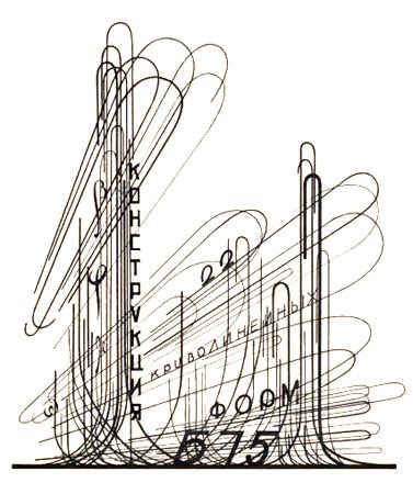
Yes, the work is as fantastic as the name. I was trolling around on my new obsession, Bibliodyssey and came across this post on the aforementioned Russian Constructivist and his incredible synthesis of architecture, typography, and painting. There is a biography here as well as many more images. Chernikhov was called the "Soviet Piranesi" by some, and until his death in 1951 promoted the idea that complexity and a reexamination of detail and even decoration was instrumental to modern design and architecture.

The more I see the more I am certain that I should be selecting my influences rather than attempting revolution.
Yes, the work is as fantastic as the name. I was trolling around on my new obsession, Bibliodyssey and came across this post on the aforementioned Russian Constructivist and his incredible synthesis of architecture, typography, and painting. There is a biography here as well as many more images. Chernikhov was called the "Soviet Piranesi" by some, and until his death in 1951 promoted the idea that complexity and a reexamination of detail and even decoration was instrumental to modern design and architecture.
The more I see the more I am certain that I should be selecting my influences rather than attempting revolution.
Tuesday, July 31, 2007
urban-historical peep show

(Houston, Circa 1891)
The Amon Carter Museum has a fantastic little toy that allows you to browse through an enormous collection of Nineteenth Century bird's-eye views of Texas cities. As they put it:
Bird’s-eye views, many of which are more than three feet wide, appear as something between a panoramic view and a map, as though they were drawn by the artist while he was suspended in a hot-air balloon. In fact, they were drawn by hand using, most often, two-point perspective to produce a three-dimensional rendering. The city views are surprisingly accurate (even to the point of documenting the presence of a tree in the middle of Gonzales Street in Cuero) and represent a much neglected source for understanding the history of Texas.
My only complaint about this website is that the flash browser is so tantalizingly small that I'm left hunched over my screen, eyestrained, scrolling around frantically, tempted by the "buy" link in the toolbar above and cursing the Carter Museum's for not providing (at least low-quality) full size images. But that's beside the point. The fact is, there is no form of art that captures aerial experience better than first-person hand drawings done while levitated. There is something beautiful about the conflict between penciled subjectivity and the exactitude of aerial two-point perspective. But enough said-- go take a look for yourself.
Thursday, July 26, 2007
an internet with less screaming
First of all, I have to point out the even more incredible than usual hodgepodge of etchings and prints over at Bibliodyssey right now. This post has a running start and just keeps speeding up, traveling through "Multi: clown vignettes; SarcoBosco astronomy; Böhme mystical engravings, allegorical book images; satirical Portuguese 19cent illustrations, German tulip and medieval anatomical sketches; ivory manuscript cover; Wisconsin bookart and many, many links." For those of you who haven't been over there, I hope you become as unexpectedly besotted (that's right, besotted) as I am. Those clowns kick ass.
In other news, I recently installed Adblock on my browser. Seeing sites like nytimes and pitchfork media without the relentless distraction of flashing ads bordering every piece of content was so foreign as to make the internet suddenly foreign. It reminded me of the sudden de-ad-ification of Sao Paolo, Brazil, which has left behind a residue like this:

More astonishing images by Tony De Marco can be found here. What both of these (prunings? cleansings?) point out to me is that the removal of commerce from their locales, while a vast improvement, does not lead to a more streamlined or cohesive fabric. The removal of these ads leave huge holes, scar tissue and voids behind. Meaning that advertisements are not additions or accoutrements; once they have been incorporated they are an integral part of a city or medium, and cannot be removed without a violent afterimage. Read even further, the various texts and images on a city are not something that is overlaid and can be changed or removed with impunity; it is integral and deep-rooted. Two recent works of art explore this kind of removal with different results. While Matt Siber's "untitled" project seems to imply that the text is a separate entity, Stinbrener-Dempf's "delete" makes a bright yellow point of the violence implicit in getting rid of city signifiers. I guess this is the base of my thought here-- advertising and signage is not just signifying. It is also an object that has an independent presence from the message it is trying to convey. And it is only after removal that one begins to see how powerful that secondary presence is.
In other news, I recently installed Adblock on my browser. Seeing sites like nytimes and pitchfork media without the relentless distraction of flashing ads bordering every piece of content was so foreign as to make the internet suddenly foreign. It reminded me of the sudden de-ad-ification of Sao Paolo, Brazil, which has left behind a residue like this:
More astonishing images by Tony De Marco can be found here. What both of these (prunings? cleansings?) point out to me is that the removal of commerce from their locales, while a vast improvement, does not lead to a more streamlined or cohesive fabric. The removal of these ads leave huge holes, scar tissue and voids behind. Meaning that advertisements are not additions or accoutrements; once they have been incorporated they are an integral part of a city or medium, and cannot be removed without a violent afterimage. Read even further, the various texts and images on a city are not something that is overlaid and can be changed or removed with impunity; it is integral and deep-rooted. Two recent works of art explore this kind of removal with different results. While Matt Siber's "untitled" project seems to imply that the text is a separate entity, Stinbrener-Dempf's "delete" makes a bright yellow point of the violence implicit in getting rid of city signifiers. I guess this is the base of my thought here-- advertising and signage is not just signifying. It is also an object that has an independent presence from the message it is trying to convey. And it is only after removal that one begins to see how powerful that secondary presence is.
Friday, July 20, 2007
how I miss my Fisher Space Pen
Subtraction is a blog by Khoi Vinh, the design director for the New York Times website. Among other things, he had a recent post on the fact that, unlike other elegantly designed items, most modern electronics, while often being shockingly well designed, are, due to planned obsolescence and somewhat to the current dominant high-tech design philosophy, are doomed to deteriorating inelegantly, if not catastrophically. The question being, why can't our iPods age gracefully, or even improve over time, like cast-iron pans or good luggage? The battered condition of your laptop or cellphone should be a badge of pride instead of an embarrassment.
My contribution to this discussion is that while lots of currently electronics are taking the right first step in divorcing enclosure from content, they all seem to have it backwards, providing interchangeable or replaceable shells for the (currently expensive) interior components. But, as hardware eventually becomes obsolete, why has nobody examined the possibility of creating a long-lasting, beautiful exterior with upgradable guts? There are obvious hurdles like proprietary hardware and no standard dimensions for most components, but some companies have more control over the future of their hardware than others. I'd be perfectly happy with recycling my cellphone hardware once a year, even paying for it, as long as it had a nice, heavy cast-iron shell. As it is, I just have to keep my trashy hinged plastic model for longer than it can really survive.
In a related note, there was a pretty fantastic article in the NYT about planned obsolescence and the unfortunate orphans it leaves in it's wake. Running shoes and digital watches aren't really getting any better, but great designs are often thrown by the wayside instead of being treated as the classics they could be, just so the parent companies can advertise something brand new. Given the iconic power of objects like Converse All-Stars and old-school Casios, it seems that perhaps better attention could be paid to recognising and preserving contemporary common classics. I'll leave you to find the article, but I will point you as far as the comments section, full of New Yorkers grieving for lost gel pens and Honda CRVs. I hope that these people carry on their collective yearning and form a society devoted to the preservation of lost common objects, tiny pieces of locally perfect design that are in danger of being forgotten.
Wednesday, July 18, 2007
radio lab
I don't know why things with the word "lab" in them seem to consistently blow my mind, but there's a new one this week. Radiolab isn't a particularly new show (it's the fourth season), but my only exposure up until now was in short segments on KCRW or This American Life. And it is. Awesome. It combines two of my favorite hybrid genres -- the science narrative and humorous documentary -- into a kind of super-melange that keeps me riveted. Jad Abumrad and Robert Krulwich (check out those names) debate socratically and interview supernerds over a consistent blanket of ambient sound in a way that is very. kick. ass.
Monday, July 16, 2007
intermodal fun
One of the things I miss most about grade school is field trips. So the ability to blow off half a day and go on a bona-fide adult field trip was a truly awesome event. We visited the Union Pacific Intermodal Transfer Facility in San Pedro, for kind of hazy and unspecific reasons (which made it all the more fun).

The "facility" is the place where containers are transferred from ship to train (with a tiny interim on a truck in-between). They had built a fairly detailed model of the facility, which was cool, but perhaps a bit of overkill. Check out the tiny little trucks:

After viewing the model we were brought up to a kind of control tower that overlooked the entire yard. Here is where the trucks check into the "ramp" (slang for a transfer yard). I swear every fifth container said Costco on the side. Note the kick-ass refinery beyond.

Here is the area where the transfers take place. Other than trains and trailers, the two main pieces of machinery were the mini-tractors that raced all over the yard pulling trailers next to the trains, and the awesomeAkira-esque gantry cranes that lift the containers into place. A skilled operator can move a container from trailer to train in less than a minute.

There was also some other pretty awesome industrial architecture visible from the tower, like this freakishly monolithic dry-storage "shed," which looked to be as big as a medium-sized Egyptian pyramid.

To the rear of the facility, you could see the source of the thousands of containers the Union Pacific moves every day-- the dockyards. The cranes look massive even from miles away. More field trips will have to be made.

Wednesday, July 11, 2007
screwy
Screw Asylum is a prime example of the internet I fear might evaporate at any moment, the fragile tiny nooks and societies that Ben Katchor invents/documents in his Julius Knipl, Real Estate Photographer series.

Also, the fine people over at SA pointed me to this fantastic Soviet ATV:
Also, the fine people over at SA pointed me to this fantastic Soviet ATV:
Tuesday, July 10, 2007
wii-ta
If one was to make a nerdy blog-post chart, cute pictures of pets would be only slightly above posts about people playing video games. This I realize. But when our dog Rita falls asleep on her back, her little front-paw hooks are just about right shape for wii-mote storage.


Saturday, July 07, 2007
Gibson made me want those 300,000BTUs
After my recent post where I blamed William Gibson on my mild obsession with post-industrial products, I feel the need to qualify this blame.
If being a futurist means condensing the present, extrapolating the result and then projecting the resulting mess outwards, Gibson did such a good job that, almost 25 years after Neuromancer, we're still relying on his idea of the future to explain the present. And part of the reason he had so much success was that, despite being one of the founding fathers of the concept of cyberspace, he spends the majority of the time writing about physical reality. He created a world where digital imagery sits as a thin coating over a substructure cobbled together with epoxy, wire and department-of-defense seconds. He spent most of his time examining what kind of people might live inside of this sub-structure.
Inherent to all of this is the idea that obsolete industrial equipment is the new raw material. What is lost in craft and detail is made up for in scale, complexity, and sheer power. This kind of junkyard, collage ideology appears again and again in his written work. In the short story Johnny Mnemonic, there is a shantytown cobbled together in the attic of a domed city, inhabited by people that call them selves "Lo-Tek." This phrase was undoubtedly borrowed by the architecture firm "Lot-ek", who have likewise absorbed the entire post-industrial aesthetic, down to the central irony that such raw solutions require, at times, very high technology.
Other examples in Gibson's work abound. In "Count Zero," you not only have high-rise housing projects with water-jet cutters, hydroponic agriculture and rooftop wind turbines, colonized and cut off from the grid, but also an assembly-line robot hacked and distorted into an automated artist, producing Cornell boxes from floating detritus. In the (horrifically named) Mona Lisa Overdrive there is a reclusive artist living in a Superfund site in the rust belt, creating robotic junkyard sculpture in an old warehouse (a reference to Survival Research Labs). His "Bridge Trilogy" centers around San Francisco's Bay Bride, taken over by the homeless as a suspended shantytown after a 9.0 earthquake. And, finally in Pattern Recognition, he has yet another techno-autistic artist, creating collaged videos with material dredged from the Internet.
These somewhat romantic junkyard notions of ad-hoc technology cut through a lot of the current obsessions of popular culture at an oblique angle, from "Loft-Style" suburban homes to mashups to laser-projected graffiti. A lot of this is simply styling even marketing created by and appealing to the generation that grew up with ubiquitous Japanese cartoon robots and misused corporate laser pointers. But it's also, in my opinion, the leading indicator of a general tendency in manufacturing; as production becomes more and more micro-scaled, cleaner, light-weight and rapid, we are beginning to treat steelyards and coal factories the way we used to treat the Parthenon and Stonehenge, as decaying, monolithic antiquities from a simpler and more powerful time. Even as the things around us are becoming polymers, carbon fibers, nanotubes, aerogels, we long for a nice hefty brick to throw through a plate glass window.
Thursday, July 05, 2007
pico and sepulveda
From the Danny Elfman-scored "Forbidden Zone". This may be the highlight. Made all the more amusing by the fact that there is nothing but a lumber warehouse, donut store, and government offices at that corner. And maybe a discount golf store. Still, were one getting directions to that location (for an unknown reason), I can see how repeating it ad infinitum would lead to exactly this.
Sunday, July 01, 2007
ersatz emotion for sale!
Walter Benjamin wrote a lot about the concept of the "aura" in art. Photography, and mechanical reproduction in general, he argued, destroyed the history and singularity and sheer object-ness of a work of art, a quality he deemed to be a kind of aura surrounding the work, giving it mystery and a kind of emotional Velcro that can be found most strongly in catholic relics and old baby clothes.
Well, folks, technology has come one hundred and eighty degrees. Have your images lost that aura that once suffused them? Are you tired of the neo-modernist emphasis on clarity and calm?
Meet Jesh DeRox, the proprietor of the reconstituted aura. Through the magic of Photoshop "textures," your special event can have nostalgia applied, long before it has naturally accumulated! You don't have to be eighty to have precious things. Finally, welcome to the photographic equivalent of pre-distressed jeans.
Saturday, June 30, 2007
collect all four
Anyone seen the article about space gloves in the NYT magazine? Someone finally won one of NASA's open competitions for new technology-- a former sailmaker invented a superior astronaut handcovering on his 30 year old Singer and won $200,000, plus a valuable patent.
This adds a whole new twist to a good new article by David Celento in Harvard Design Magazine. In between making fairly accurate assessments of contemporary practice, prefabrication, rapid prototyping and fabrication, and BIM, he makes this point:
This has been said before (and more eloquently). But I am not going to take the next step in exhorting all young practitioners to take up the mantle of rapid fabrication and systems design, claiming that if we don't do it, someone else will, relegating architects to mere decorators. That's Arup's line, and I don't buy it. No matter how monolithic the pieces of a building get, you will still need someone to negotiate between all of the internal and external pressures. Someone to dance around keeping the water out and holding it up, while keeping their eyes focused on something more distant. If anything, industrial designers might take this place, and if they do a better job, maybe they deserve it. Maybe we will see a collapse of building, furniture, and device, and we'll all live like Dave in 2001. But if the future is all about products and consumption, why the hell would people choose to buy one thing when they can buy hundreds? And hasn't the last half-century taught us that monocultures are weak and potentially hazardous?
I think that the near future will be just as haphazard, heterogeneous, and multilayered as the present. And we should be here to reap the chaos, and nudge things towards a slightly more ordered state.
This adds a whole new twist to a good new article by David Celento in Harvard Design Magazine. In between making fairly accurate assessments of contemporary practice, prefabrication, rapid prototyping and fabrication, and BIM, he makes this point:
Architects are among the very few providing custom design services in a product-infatuated society. this presents a profound problem, especially since few clients possess an understanding of the efforts necessary to create custom, products, and even fewer are willing to adequately finance themAnd this one (about the current state of government projects):
An imperfect but illustrative parallel in manufacturing would be if Boeing were contacted to digitally design and construct a one-of-a-kind “blue-sky” airplane. The client is interested in exclusive rights to Boeing’s five years worth of design data, prohibits Boeing from making more than one plane, will only pay for error-free parts, and expects to pay little (or no) more than the cost of a standard plane of similar size. Boeing wouldn’t even bother to return the call, yet architects are competing for design opportunities where the conditions aren’t that much different.Somewhere between space gloves and t-shirts we have a new solution. Art museums and megamansions can still be made painstakingly bespoke, but perhaps what we should really be competing for and slaving over are systems: structural furniture, cladding signage, countertop/lighting, or even just a better way of doing ceilings. Once the production of an object goes beyond a few dozen, the cost of designing that object becomes only a tiny part of the process, instead of fifteen percent, giving the designer a lot more leeway, and a lot less breathing down the neck.
This has been said before (and more eloquently). But I am not going to take the next step in exhorting all young practitioners to take up the mantle of rapid fabrication and systems design, claiming that if we don't do it, someone else will, relegating architects to mere decorators. That's Arup's line, and I don't buy it. No matter how monolithic the pieces of a building get, you will still need someone to negotiate between all of the internal and external pressures. Someone to dance around keeping the water out and holding it up, while keeping their eyes focused on something more distant. If anything, industrial designers might take this place, and if they do a better job, maybe they deserve it. Maybe we will see a collapse of building, furniture, and device, and we'll all live like Dave in 2001. But if the future is all about products and consumption, why the hell would people choose to buy one thing when they can buy hundreds? And hasn't the last half-century taught us that monocultures are weak and potentially hazardous?
I think that the near future will be just as haphazard, heterogeneous, and multilayered as the present. And we should be here to reap the chaos, and nudge things towards a slightly more ordered state.
Wednesday, June 27, 2007
Two views of I-45
Today, two different ghosts of Houston's automotive past, both sent to me some time ago by Jean:

The first, a planned expansion in 1946 (pulled from a newspaper article) that shows how freeways (or "urban expressways") used to get planned... a gradual slowing of traffic through an intensification of on andofframps (incidentally beautiful from above), until it spreads out into a downtown "delta", which reconnects at the other end of the city into tributaries. Note the striking similarity in image and concept to the human circulatory system, albeit one that does not circulate. An oscillatory system, I guess. Nevertheless, it does show that as they were originally conceived and constructed, freeways did not strangle or bypass cities any more than a half-dozen railway stations strangle or bypass Paris. Here is symbiosis, not separation.

A mere fifteen years later, demolition had already begun to run an elevated expressway directly south of downtown, directly through a busy and successful commercial street (Pierce). The property values on this right-of-way were so high they could only purchase one-half the requested width, and Pierce elevated remains narrow today. This diagram was lifted from a detailed (if not terribly critical) history of Houston's transportation systems, commissioned by TXDOT . Look at the 45/59 interchange in the lower right--did you know that it took up more than six city blocks? According to the last census, 43% of land in downtown Houston is taken up by right-of-ways. 2.4% of this same area is public open space. Perhaps some of this transportation space could serve a second use...
Tuesday, June 26, 2007
industrial consumerism
When I am overcome by the desire to own something, it is almost always an industrial, not a consumer product. I think this may be the product of too many William Gibson novels in my youth-- the idea that sparsely designed, no-frills tools are superior to the chaff sprinkled on the common people. So, when we were talking about kitchens, I got excited by the 300,000 BTU 10-burner superranges at Surfas. I can spend hours looking at foam rubber and vapor-tight light fixtures at McMaster-Carr. It's even influenced my choice of offices-- I am thrilled that I get to work with a factory every day.

My latest obsession is from ISO. Yes, the International Standards Organization. Yes, the people that brought you such blockbusters as "ISO 22000: Food Safety Management Systems" and "ISO 14000: GHG emissions accounting and verification." What has me all hot and bothered, however, is ISO 7000: graphical symbols.

For a little over $200 (paid in Swiss Francs, natch), you can get over 2,400 fantastic standard icons, from the seat belt symbol, to low tire pressure, to the ever-popular "lightning-bolt" danger triangle, in several formats! Think of all of the uses-- someone at my office already suggested a machine that prints a different icon-based t-shirt every day, for six and a half years.

I'm saving up.
My latest obsession is from ISO. Yes, the International Standards Organization. Yes, the people that brought you such blockbusters as "ISO 22000: Food Safety Management Systems" and "ISO 14000: GHG emissions accounting and verification." What has me all hot and bothered, however, is ISO 7000: graphical symbols.
For a little over $200 (paid in Swiss Francs, natch), you can get over 2,400 fantastic standard icons, from the seat belt symbol, to low tire pressure, to the ever-popular "lightning-bolt" danger triangle, in several formats! Think of all of the uses-- someone at my office already suggested a machine that prints a different icon-based t-shirt every day, for six and a half years.
I'm saving up.
Thursday, June 21, 2007
move to bejing? $2000
I've mentioned before that it often seems like the future is already here, it's just looks to boring to be noticed. Seabox is a custom container company that makes the current mobile-design architects look like kids in a sandbox.

 This may not look like much, but here's the description:
 Here we have an open-frame, stackable "ratpac" system with reconfigurable exterior and interior partition walls, capable of pretty daring cantilevers. It was designed as a system for SWAT urban warfare training. Check out the shiny interiors:


Sinister and kick ass.
For something more heartwarming, try this:


Oh, just a portable standing wave generator. Shippable, of course. There are also portable workshops:
 And, of course, you could just hire them to make impromptu ziggurats and 100 foot walls, on demand--here's a temporary outdoor movie screen in Central Park:
 And, of course, the requisite art opening monoliths:


These guys will design for you a 40' container with integral generator and A/C unit, built-in furniture and even a little plumbing. And since everything still meets ISO code for international shipping, you can ship your house at the going rates (currently, about anywhere in the world for $3000 or under. And China is especially cheap). For a harder sell, check out this video.
I'm going to petition Seabox to change their motto to "Up Yours, Lo-tek."
This may not look like much, but here's the description: In the closed configuration, the structure meets all the ISO requirements for transportation on a container ship. Once on site, the Folding House can be set up in about one day. Custom designs and materials are also available.For those of you that are a little more impatient, there's a version that involves a tentlike configuration that can be unfolded in under 20 minutes. Or if you desire the bad-ass over the expedient, go with one of these:
Here we have an open-frame, stackable "ratpac" system with reconfigurable exterior and interior partition walls, capable of pretty daring cantilevers. It was designed as a system for SWAT urban warfare training. Check out the shiny interiors:Sinister and kick ass.
For something more heartwarming, try this:
Oh, just a portable standing wave generator. Shippable, of course. There are also portable workshops:
And, of course, you could just hire them to make impromptu ziggurats and 100 foot walls, on demand--here's a temporary outdoor movie screen in Central Park:And, of course, the requisite art opening monoliths:These guys will design for you a 40' container with integral generator and A/C unit, built-in furniture and even a little plumbing. And since everything still meets ISO code for international shipping, you can ship your house at the going rates (currently, about anywhere in the world for $3000 or under. And China is especially cheap). For a harder sell, check out this video.
I'm going to petition Seabox to change their motto to "Up Yours, Lo-tek."
Subscribe to:
Posts (Atom)

